How to Choose the Right Kitchen Color Schemes when Remodeling
Posted by KraftMaid on 2nd Dec 2020
Afraid you’ll pick the wrong colors for your new kitchen? Our design expert will help you pick a palette that you’ll love. Whether it’s a subtle, tone-on-tone design or a bold, bright statement, color sets the mood in any room. Not to mention, it’s a great way to express your personality. But when those colors appear on big-ticket items, like kitchen cabinets, floors and countertops, it’s also a big commitment. The experts at KraftMaid® have some tips to help you get it right.
Determine your color scheme.
One way to approach color selection for your cabinets is to have an overall kitchen color scheme in mind when you begin. This can be as simple as choosing three colors you like.
It’s OK to start with broad color categories – white, brown and green, for example. Or three similar colors, like cream, tan and chocolate. As you begin to explore specific finishes and material options, your palette will become more defined.
Expert advice: If your kitchen opens to an adjacent room, you’ll want to pull the dominant color from that space into your kitchen color scheme. This makes both rooms feel connected and ensures they’ll flow.

Think in a 60-30-10 proportion.
You’ve got your general scheme in mind. Great! Now which color goes where? Designers often use the 60-30-10 ratio as a guide. One color from your scheme becomes the main color that’s featured in about 60% of the room; a secondary color is used in another 30%; and the third color is treated as an accent in the remainder of the space.
Expert advice: You can sprinkle your accent color throughout the room, or you can feature it in one concentrated area, like a focal wall or contrasting color on your center island.

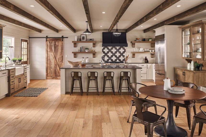
Warm white and rich browns dominate the color scheme in this farmhouse-inspired kitchen. Cabinet hardware, backsplash tile and countertops bring in dark wrought iron and charcoal accents.
Start designing your kitchen.
It’s time to bring your color scheme ideas and the color proportion rule together as you select your finishes and materials. Your kitchen designer will be there to help guide you, but here are a few approaches to keep in mind:
• Start with your cabinets. Since your cabinetry will take up the majority of the space in your kitchen, you might want to pick your cabinet finish first and consider that the foundation of your color scheme.
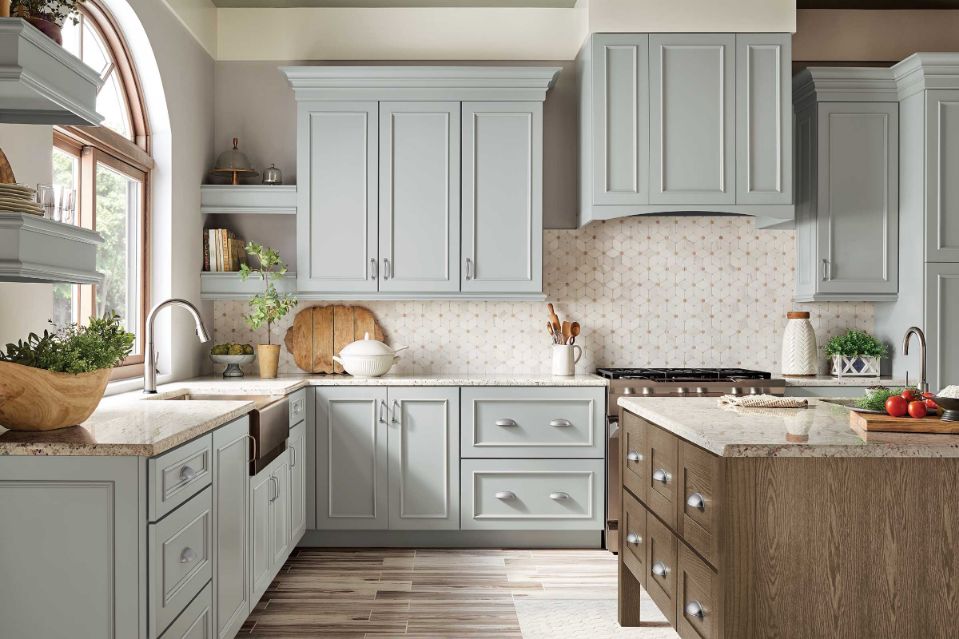
• Try a contrasting floor color. Generally speaking, it’s pleasing to see some contrast between cabinet and floor colors. Think: Dove White cabinets with dark walnut hardwood, or cabinets in Cannon Grey stain with a Carrara marble tile.
• Pick a countertop to match. Your countertop might play off of your cabinets or your floor, or it might feature colors from both to tie it all together. With a wide spectrum of materials and color choices, you’re bound to find one that will complement your scheme.
• Think about what you want to stand out. You can use color to highlight one element in your room. Maybe it’s an all-white kitchen with a vintage gas stove painted in fire engine red enamel or a wall of pantry cabinets in Translucent Limestone to set them off from Kaffe-stained cabinetry in the rest of the room.
• Test out your options. Lighting, both natural and artificial, can shift how colors appear. So before you commit, get samples of your color choices to see them together in your kitchen. Observe how they look during the day and at night to make sure you love both.

Still not sure where to begin?
Even with a plan, finding the right colors can be a challenge. So we’ve got a few more ways to help. You can kick things off by finding a model kitchen to use as your inspiration. Browse through our gallery to find a few you like. Then, use our kitchen visualizer tool to try different combinations of colors and materials on a virtual kitchen scene. It’s an easy, risk-free way to see how colors work together in a finished space.


